Poco India unveils its new logo and mascot, after a year of becoming independent from Xiaomi. It is India’s 3rd largest online smartphone brand. This move pushes for a new visual identity, with a brand new logo and brand mascot. In addition, it aims to challenge the status quo, much like the Gen Z. Moreover, this new logo specially re-defines madness, the Poco way.
Also Read: Asus ROG Phone 5 India Launch Tipped For March
The new mascot has a halo on top that signifies the sense of goodness. POCO says that its version of “Mad” comes with a cause. Let’s take a look at the POCO India brand new logo and the mascot.
POCO Refreshes Its Image With A Brand New Logo And Mascot
The world isn’t full of thinkers. It’s full of same-ers. ?
— Madder By the Minute (@IndiaPOCO) February 18, 2021
We’re whipping up a batter of MADNESS
To make the world better ??
(and less BORING)
Add ?̶ fun powder to taste#MadeOfMad pic.twitter.com/lcIq1GKfuw
This move from the company reaffirms it is a separate brand. This announces the ‘Made for Mad’ rebranding with a brand new logo and mascot. According to sources, it is imbibing with the intent of re-defining madness, the POCO way. With ‘Made of Mad’, the brand new logo invokes a confusing emotion in the minds of the consumer. Moreover, it is a representation of every individual who is looking for greater alternatives to the mainstream.
Also Read: How To Buy XBOX Series X & Series S In India?
Additionally, Poco reveals it put a lot of thought into designing this emoji. It explains how each little piece fits into the equation to “redefine madness, the Poco way. Look at the image below to understand the brand new logo and its mascot’s meaning:
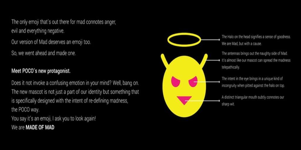
“The new mascot is not just a part of our identity but something that is specifically designed with the intent of redefining madness, the Poco way. You say it’s an emoji, I ask you to look again! We are Made of Mad”.
reads the press note.
According to the image, it signifies the Halo on top with an angel-like crown. The company says that this Halo on the head signifies a sense of goodness. In addition, the antennas bring out the naughty side of Mad.
The eyes bring in a unique kind of incongruity when pitted against the halo on top of the head. Lastly, there is a distinct triangular mouth that subtly connotes the company’s sharp wit.
Also Read: Top 6 Signal Messenger Privacy Settings That You Should Use
It looks like POCO will continue to shock, surprise, and delight the world of smartphones but never, ever, succumb to being boring or predictable. The brand new logo and mascot will integrate into the brand’s campaigns across different mediums. Moreover, the rebranding makes it look like they are planning to cater to Gen-Z with its value-for-money offerings.


